In the last article, we reviewed how graphs are an ideal format to convey information at a glance. But if you’re going to render your analytics in graphical form, which graph type should you use? Does it matter? Are they interchangeable?
Well, yes and no. They are interchangeable to a degree, but even so it does matter which one you use. Some are better than others in certain situations. So to make your analytics most impactful, it’s a good idea to understand where each graph type shines and why.
Here is a summary of are the graph types most commonly used in Vista Analytics, and when is most appropriate to use them.
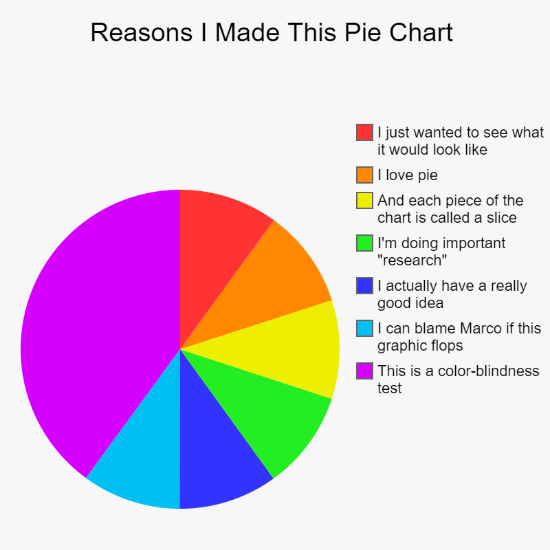
- Pie Chart: Use this when you want to relate relative sizes of individual components to a whole, especially when your intent is to emphasize those relative sizes, not just the raw numbers. For example, a Pie Chart can be a useful way to look at employee headcount by department.
- Donut Chart: This can be considered a variation of a Pie Chart. Generally, if your intent is to highlight that one portion of the pie (one or two slices) is significantly greater than others, then a traditional pie chart conveys that information most clearly. But if you find that the relative sizes of your slices are closer together, then a Donut Chart better conveys that.
- Column Chart: Use this when you want to compare the relative or absolute sizes of different categories (similar to the above two), especially when the different categories don’t add up to a whole. For example, if you wanted to compare the 401-K participation percent by department, it doesn’t make sense to represent them as a pie because each department’s percentage is independent of other departments. (So, although a pie chart can convey that different departments have similar participation percentages, a pie chart would also imply that the different slices add up to a whole, which they don’t.) Another time when you would use a column chart over a pie or donut chart is when it is important to compare the relative sizes of each category vis-à-vis a benchmark (i.e., the height on the Y axis). And finally, column charts are valuable when you want to include sub-categories in your visualization. This is when you would use multi-category column charts, of which there are two kinds.
- Side-by-Side Multi-Column Column Charts: If the sub-categories don’t add up to a whole (or if that is not the key point to be conveyed), then side-by-side columns are better. For example, if you wanted to show the same above 401-K participation rate by department, but show the participation rates for each of the last 3 years, it’s more effective to have a side-by-side column chart than three separate charts. Each column group would be one department, and within that group would be three bars – one for each year. Then, at a glance, the user can easily notice comparative rates by department, a possible trend across all departments by year, and any anomalous trend for just one department.
- Stacked Multi-Column Charts: Stack your columns when the sub-categories add up to a whole and it is important to convey their relative contribution to the whole. As an example, stacking columns would be useful if we wanted to show the raw counts of employees participating in a benefit plan, broken down by location within departments. Then each bar could be for one department, with segments of that bar making up each location (adding up to the total count for the department).
- Line Graph: Line graphs, at first glance, can be used similarly to column charts. (Basically, take what would be a column chart and draw a line across the tops of each bar.) But there is one major difference. Line graphs imply continuity, whereas column charts imply disassociated categorical data. In a general sense, think of using line graphs when measuring data across time, and think of column charts when you are measuring the same thing across different attributes (e.g., department, gender, age, ethnicity, location, education level, etc.).
- Scatter Graph: Use these when you wish to plot measurements against two scales simultaneously. As examples, consider two of the most famous types of Scatter Graphs – The Gartner Group’s “Magic Quadrant” and “9-Box” Performance Reviews. Although both artificially break down their graphs into sections (the Magic Quadrant draws 1 vertical and 1 horizontal line to make 4 sections, and the 9-Box employs two lines in each direction to carve out 9 sections), they both measure a group of somethings (companies for the Magic Quadrant and people for 9-Box Reviews) against two chosen dimensions. For the 9-Box those dimensions are typically performance vs. potential, and Gartner generally measures “completeness of vision” vs. “ability to execute”. In both cases, your eye naturally moves to the top right to see the entities who measure best in both categories.

Marco Padovani
Senior Development Manager | PDS
mpadovani@pdssoftware.com
